Month: January 2011 (Page 1 of 2)

Digital Art Class

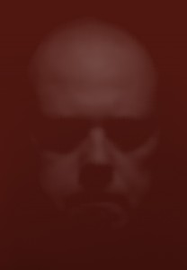
This class is proving to be pretty fun.  I don’t particulary enjoy going through the lessons in the book, but I know that they will help me get more familiar and comfortable using the 5 gazillion tools that are available in Photoshop.  Last week I was given my first project for the class.  The project is to take a photo (can be digital or print), make it black and white if needed, and then to hand color the photo.  The instructor (someone for whom I have a great deal of respect) does not want us to color it like the original.  She wants us to get creative with the colors and to not be afraid to use some of the more funky brushes that are found in Photoshop.

I must admit it took longer than I thought it would to find a photograph to use, but in the end I selected one of my own:

Click the photo to enlarge.

I took this photo last summer at Minnesota Vikings Training Camp in Mankato, MN.  I thought this might make a good starting point since it has some detail, but is not so detailed as to require pixel-by-pixel coloring to get a good result.  I’ve been working on this since about Friday for about 2 hours each day.  It’s definitely taking longer than I thought it would, but it’s coming along very nicely.  I’ll share with you all once I have the final coloring done.

Well…

It’s only the 2nd day of class so I didn’t really learn anything I didn’t already know. But that’s ok, it gave me time to experiment a little in class and inspired me to experiment a little at home.

I somehow always knew Cy Twombly’s art would influence me in some way.  I’m not talking about his paint or chalk scribbles, but his very large and nearly solid color canvas paintings.  The Menil Collection here in Houston has an outbuilding dedicated just to Cy Twombly.

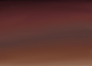
This was me experimenting with color blending, just as one would with a real paintbrush.  I didn’t really have a plan going into this – the picture just sort of created itself.  Perhaps it’s the final hues of a day that’s about to end.  Perhaps it’s a blurred closeup of Jupiter seen from space.  Maybe it’s a red-hued scale showing that there are very few absolutes in this world – most is just a shade of one of the 2 extremes.  Or, it may have just been a guy with some time to experiment a little with his computer drawing program thing-a-ma-jig.  That’s the great thing about art – there is never 1 correct answer.

Perhaps I can find a way to make something similar to the work of Mark Rothko.

While this isn’t a photograph, this is part of my evolution.  Does anyone have any comments?

PS – This looks pretty awesome printed on Anasazi Canvas…  I might need to have this one mounted.

Next Step

Yesterday I began the next step in my evolution. My Digital Art course began yesterday and today my Art History I and Composition II courses begin. I’m looking forward to the art courses as well as the composition course. The composition course, aside from being a requirement, will definitely help hone my critical thinking skills as well as my writing. I have to admit that I’m a little ambivalent about Art History I. I suppose it will help give me a sense of where the collective art world has come from and where it can go, but frankly I found art history utterly boring in high school. Hopefully the instructor can find a way to make it exciting and challenging on a deeper level than just looking at ancient scultpures honoring the sacred feminine.

The digital art course is the one that piques my interest the most.  For all of my post-processing work I use Adobe Lightroom 3, which I find gives better results and finer control than Apple Aperture.  I tried using Photoshop CS2 to do RAW processing, but found it to be incredibly lacking in terms of control and output.  It eventually got to the point where I used CS2 for 3 purposes:  TWAIN capture, correction of scratches and dust spots from film scans, and as a vehicle for making prints with my Epson R2880.  I pretty much taught myself how to do these things (and a few more), which I count as a small victory.  Photoshop is a very large, very powerful, and not very user-friendly monolithic program that can be daunting when one is exposed to it for the first time.  Tips and tricks from various websites have helped here and there, but I’m thinking that in order to unlock its true power I’m going to need a structured setting.  Now that I have a copy of Photoshop CS5 (thank you, education discount!!) I can couple that with the course and truly create some good stuff.  The fact that this is a requirment for a BFA Photography doesn’t bother me in the least.

In the next month or so I hope to sit down with an advisor and hammer out a plan of attack in order to apply for the BFA Photography program at the University of Houston.  Entrance to the program is competitive but I still need these courses (along with a few others) in order to apply.  Of course, between my dental issue and my current bout with kidney stones I hope I can find an opportunity soon.  Also, this will give me plenty of time to really beef up my portfolio.

Well, I must get back to work…  have fun everybody.

Magical Morning by Magnus Lindbom

Magnus Lindbom is a self-taught professional photographer from Sweden.  He earns all his money from photography-related work such as writing articles for publication, leading photo tours and workshops, and selling prints.  His goal with photography is “to inspire others to venture out into nature and experience for themselves what so many of us are missing in today’s hectic urban life”.  His concentration on landscapes (both color and black and white) have given us some amazing photos which seek to capture feelings rather than the place it was shot.

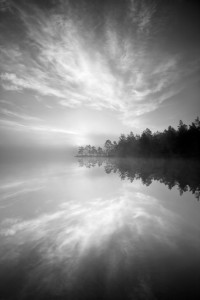
This photo, entitled “Magical Morning”, was taken at Tyresta National Park in Sweden.

The first thing that jumped out at me was the serenity that this photo conveys.  The mist on the water hides any ripples that would convey energy while allowing the reflections of the clouds and trees to come through with good clarity.  The gradations in the tone are nice and smooth, which definitely adds to the feeling of witnessing a serene morning sunrise.  As the scene appears to be backlit, that makes the gradations of tone (not to mention the great exposure) all the more impressive.  While I’m not a fan of placing the horizon in the center of the frame (something I have been guilty of more than once in the past), here the mist blurs the horizon enough to make one have to imagine it’s there.  In turn, the mist also makes obvious where the water meets the land.  While this helps the viewer see where the reflection begins, it does put a damper on what would have been the appearance of the land floating in the air.  In terms of composition all three elements (land, water, and air) are in good balance, with all three competing for, but none winning, attention.  The symmetry of the land and its reflection are almost insignificant when the photo is taken  as a whole.

All in all this is one of the best entries in this year’s “Folios” edition of Silvershotz.  The tones and mist definitely convey a sense of serenity and calm, enough so that the location of this scene is the very last thing I thought of when I looked at this photo.

More of Mr. Lindbom’s work can be seen by clicking here.

Anyone else have any thoughts?

Evening Clouds by Nenad Saljic

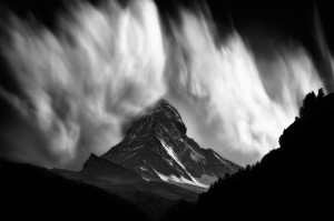
Croatian Nenad Saljic fell in love with photography and the mountains in his early teens.  Of course, life has a habit of getting in the way and in the course of some life events, he pretty much left his passions unpursued.  Fortunately for Saljic (and the rest of us) he rediscovered his passion for photography and has graced us with some beautiful black and white photos.  In 2009 and 2010 he produced a series called “Matterhorn”, which are, of course, shots of The Matterhorn in the Pennine Alps.  The photo below, entitled “Evening Clouds”, comes from this series (click on picture for a larger view):

Few things can bring forth the image a grand conjuration than watching clouds borne from orographically influenced winds.  I was treated to a few myself as a Weather Observer in the United States Air Force, although admittedly nothing to this scale.  I’m reminded of the great eye of Sauron from the Lord of the Rings trilogy.  I wonder if this is the last thing that most of the rest of Middle Earth will see before the shadow of death descends upon them.  One almost gets the feeling of being a Hobbit watching from a hiding place as the conjuration of evil begins to really take hold.

The play on the tones is the part that sets the mood of this photograph.  The dark foreground tones suggest a hiding place – we have our safe vantage point and as long as the mountain can’t see us we are safe.  The moutain itself is mostly low-key in tone.  Toward the bottom it is lighter and gets darker as you go up, which suggest that a transformation of sorts is taking place.  Of course, the clouds are the stars of this photograph.  The brilliant white stands in stark contrast to the rest of the photo, letting us that we are in for something.  The beauty of the clouds belies both the violence that produced them and the violence that is sure to follow their conjuration.  And when one looks at the fact that the peak of The Matterhorn is enveloped by the clouds, one can’t help but get the impression that they’re in the path of the full force of what’s to come.

Of course, these clouds are merely the result of updrafts over the surface of the mountian.  Even though I can’t see the rest of the sky, I would safely assume that support for these clouds is almost non-existent at a few miles from the mountian itself.  Of course, not many people outside the meteorological community (or those who live near the mountain) would necessarily know that.

Normally when we see photographs of the power of nature, it’s in the aftermath of whatever phenomenon took place.  This photograph provides a rare glimpse at how powerful nature is, even on a small scale.  What makes this photograph even more powerful is that it almost seems to contain that power, even though we know what’s coming toward us.  The play on the tones of the photo suggests a doom scenario where Mother Nature is releasing her full power and the viewer, unfortunately, is about to be caught up in it.

Saljic uses HDR processing pretty extensively in a lot of his more static work, which unfortunately makes his finished photographs look almost like rasterscan line drawings.  His “Matterhorn” series (at least from what I can tell) is free of HDR processing, which sets this series apart from most of his other work.  You can view more of the series by clicking here.

Would anyone like to discuss this photo further?

Rejections from the Final Project

I knew I wanted to include at least one picture of one of my dogs in my final project once the vision of direction became clear.  I was originally going to do them all in digital (since material waste isn’t a factor) but since I had exhausted my ideas with 35mm I decided to see if I could luck out on finishing the roll.  As luck would have it, I did get some really good photos with my 35mm film camera, but of course, I had to decide which one would make the final cut.  It was by no means an easy task.

I really liked this picture of Ozzy, my Beagle, but it seemed there was something not quite right with this one.  The colors were good and the soft focus gave him a smooth look (Beagles tend to have small but apparent wrinkles on their snouts and jowls, which is one of the reasons they have such powerful noses).  It finally hit me that the reflections of light in his eyes were what threw the entire photo off.  The reflections give him an otherworldly look that to left me feeling a little less than comfortable.  So, this shot went out the window.  I was kinda disappointed as this was my first choice upon inspecting the negatives prior to scanning.

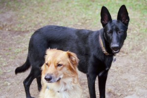
I liked this picture first and foremost for the composition.  It isn’t your conventional animal portrait.  Both dogs are looking in the same general direction and Sharon (the German Shepherd/Golden Retriever mix) is looking forward with intent while Angela (the black German Shepherd) is trying to figure out what’s going on.  The biggest problem I encountered with this one was a matter of depth-of-field, with Angela not being fully in focus.  There was also the problem with the Newton rings on Angela (that’s a downside to using flatbed scanners for film).  Try as I might, I just could fully eliminate the rings.

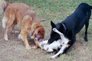
I pity Ozzy sometimes when the ladies gang up on him.  This picture stopped a good bit of the action but there was just enough motion blur to give me a sense of the intensity of their play.  Compositionally this isn’t a bad shot and you can get a sense of Ozzy’s frustration by his expression and his baring of teeth.  Ultimately, though, I decided I wanted to go a little less violent with my picture selection.  Otherwise, this one may have made it in as the selection for the 35mm film camera.

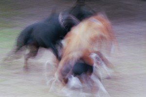
Three young dogs tend to move very fast in their wrestling matches.  This photo was actually a mistake on my part as I forgot to double check the settings when I went from aperture-priority mode to full manual mode (for some stupid reason I thought they would remain the same).  The result was a nice motion blur.  The motion blur hides the violence rather well, but in the end I just wasn’t feeling this one.  When I look at it now, I think there was just a little too much blur in the photo.

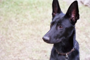
This was one of the finalists in my search for the picture to be included in the final.  I loved the look on Angela’s face when I took this photo.  It has the look of a puppy (she was just over a year old at the time it was taken) with curiosity yet trying to maintain her composure in case her curiosity turned out to be danger.  The rejection came from the composition.  Her right ear is cut off at the tip while the left ear remains whole.  Also, there’s a little piece of something in the upper right corner of the photo that I found distracting.  I supposed I could have cropped it out, but to be honest the cropping did not look much better than the original.  Otherwise, I loved the tonality and color balance in this photo.

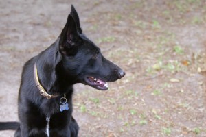
As you may or may not recall, this was my selection for inclusion in the final project.  Angela manages to keep an air of dignity about her as she fights through the exhaustion of her previous running around.  Also, she continues to watch for danger even while obeying my command to sit.  Compositionally this is a very simple photo, which is something I continually strive to accomplish.  The grass is vivid yet subdued enough that it doesn’t compete for attention with the subject of the photo.  Plus, in my opinion, Angela is a beautiful example of a black German Shepherd with German bloodlines.

Anyone have any thoughts?


Random Mumbling Post 2011-1

The Silvershotz annual ‘Folios’ issue just recently hit the newsstands.  Aside from being one of my favorite magazines to look at the world of art photography, the ‘Folios’ issue is one I look forward to each year as it contains work by emerging artists and those who are not strictly photographers but have an artistic talent for photography.  The 2009 issue contained a lot of great work, some of which really inspired me.  The 2010 issue seems a little disappointing by comparison.  More than a few of the pictures I see in this year’s issue seem to have a snapshot feel and some are so out there that I’m left wondering if the quality of submissions this year was just at a low.  That’s not to say that the whole issue is bad because there is some excellent work to be found in the pages (some of which I may discuss soon).  Perhaps I’m becoming more discriminating?  That’s a matter of internal debate at this point.

Since we’re on the subject, there exist a few photography magazines which I read on a regular basis.  I read Silvershotz, Photographic TechniqueColor, and another I can’t quite recall (it’s a technique-oriented magazine).   Silvershotz and Color focus on art photography (although Silvershotz does include some informational articles and sometimes a product review).  Photographic Technique focuses on some of intermediate and advanced techniques used to process photographs, both digitally and in the darkroom.  It also includes a product review, which is focused the processing side of photography.  The last magazine is strictly about shooting technique, and it has given me more than a few pointers on what to look for when setting up my shots.  Most other popular photography magazines seem to deal more with gear, which is not where I believe one focus their energy when engaged in photography.  And seriously, do we really need to read articles about the latest bags from Lowepro or the new CF cards from Sandisk?  Every once in a while they will mix a camera review in there as well.  That’s not to say those magazines don’t have their place – if I’m looking to add a new piece of gear, I will sometimes consult one to get their thoughts, but that’s about it.

Thankfully most of my discussions with other photographers about gear have mostly been based in the need for input, feedback, or information.  I have had a couple of gear discussions in the past where the other photographer has bragged about all the higher-end stuff he or she uses (as they looked with disdain upon my little entry-level DSLR).  Those discussions tend to grate on my nerves and, if I can’t steer the discussion to something more substantive, leave me looking for the nearest exit.

On the gear front, I did pick up my backdrop rack the other day.  I’m pretty excited about it.  While I meander my way through a small health issue and a pending dental procedure, I can try to do some larger scale still life shots in my living room.  I do have a small “Studio in a Box” contraption that I got on the cheap (I used it to to take the photos of my cameras for my final project) but its small dimensions don’t make for much flexibility in object selection.  I could barely get my Pentax 645 in the frame without showing the sides of the lightbox.

Now you have the meandering thoughts swirling in my head for today.  I must take my leave as in about 8 hours I need to cancel an appointment in order to find a more cost-effective way to get something done I need done.  So, to all of you, my faithful and not-so-faithful readers, I bid you goodnight.

A Thought

I wrote this essay in 2008 as part of a one-off photo book I made as a gift for my grandmother. It was an expression of my definition of art. Here is the essay in its entirety:

Art is what we make it. I’ve always believed that. I once had a conversation with someone who had been accepted to art school and was excited about it. For some reason I felt the need to say that art is what we make it. This person told me that he, fortunately, “has grown above that”. Some people just don’t get it.

Everyone has a different aesthetic. Even two people who have similar ideas will look at a famous work of art such as The Mona Lisa or the Statue of David and come away with very different feelings about both pieces.  Take this a little further – when these two people produce a work of art on their own, they both will produce very different pieces.  One may not like the other’s work, but to each person the piece they produced is art.

That’s because art is an expression.  That, however, begs the question of what kind of expression is art?  The beautiful thing about art is that it can be an expression of anything at all.  It can be how one feels about a certain subject; it can be an expression of how an experience affected them; it can be an expression of a happy or sad memory.  The possibilities are endless.  There is a story that a German military officer had met Pablo Picasso after the Spanish Civil War.  The officer, upon realizing with whom he was speaking, said “You’re the one who created Guernica“.  Picasso’s response to this was “No, you’re the one who created Guernica, not me”.  This famous painting was Picasso’s reaction to the horrors of war he witnessed during the German bombing campaign in Spain.

When one has something to express, there comes the question of medium.  The possibilities here are also endless.  This is also where people get easily frustrated.  I know in my own case I’ve given up more than one painting project due to the fact that I’m not very skilled with a brush.  Give me a quill pen and some ink, however, and I’m good to go.  Working in any medium takes a little practice to become effective.  I spent many hours developing the fine control required to use a quill pen so I could achieve the clean lines necessary to add power to my work.  Dancers spend many hours practicing their steps, actors study their lines and characters, and writers learn the best use of words.  Skill with a chosen medium is necessary because without it the end result will definitely suffer.

The other beautiful thing about art is that there aren’t really any hard and fast rules.  This is the what I feel is the essence of art.  Where science depends on the order that be achieved through mathematics, art breaks through this order and opens up realms beyond what can be described by math.  We can see a black hole reduced to mathematical expression, but I have yet to see the same done with a Renoir painting.

But of course, when one applies art to the concept of design we begin to see rules.  Designers have an art background, but their focus is on using their creativity to produce something acceptable for someone else.  While there aren’t strict rules to design (not any of which I am aware), there are strong guidelines that designers use that have shown to be effective in pleasing their customers..  While design work is art in the sense that creativity is present, it isn’t a pure form or art where the expression of self is the core motivator in creation.  When I think back to the prospective art student, I believe that he hasn’t grasped why people create art and that he believes that design and skill with a chosen medium are the core of what art is.

When I was in high school I seemed to have an aptitude for mathematics and science but a love for art.  I graduated from high school with five credits both in math and science and four in art.  Twice a day I worked within the rules and structure of math and science and once a day I was able to break out of those confines and let my soul out through whatever medium were we employing in art class.  Let me be clear – I loved science as well as art.  The question I never asked myself at the time was how to resolve the love of both.  The answer would be presented a long time after I graduated from high school.

I took my first photography course in the Autumn of 2007.  We worked with black and white film for this course.  A big part of the course was learning how to develop film by hand and print the photos using a dark room and chemistry. This is the simple part when one begins to consider the physics involved merely in the use of light when taking a photograph. I had never experienced a class like this in the past.  Just like in high school art class I was creating something, but to create I needed to follow the rules for the chemistry involved.  And when I manipulated the science, I came out with different creations each time.

One may say that is what happens in science – if you manipulate the components you get a different end result.  The next logical question is “where is the art in photography?”.  It is true that manipulation in science gets different end results (like adding hydrogen to vegetable oil to get shortening).  However, when it comes to photography, it begins with the photographer’s imagination.  To make a great photograph you need the imagination to see what you want to see come through on the paper.  Without that imagination, then it’s merely design work to please a customer.  Granted, it could be said that it took imagination to create shortening, but when one knows the chemical properties of saturated fats vs. unsaturated fats and knows that the addition of hydrogen will remove the kink at the end of a unsaturated fatty acid chain, thereby allowing saturation to occur, well, I have a hard time seeing imagination in that.

Expression involves showing the world something that’s important to you.  With photography I now have a way to show people what gives me wonder, where I find beauty, and what affects me.  The best part is, I use both art and science with it comes to creating my expression.  That is why I love photography as a medium.

Anyway, that is my little scribe on how photography is an art.  I felt it necessary to share this with everyone as recently a commentor expressed some disdain for the elitist attitudes that some “artists” hold for photography as a art form.  I personally have to say I agree with the commentor.  The example of the prospective art student shows why.  I do, however, like to read what they have to say.  That’s part of the Sun Tzu mentality I have…  I do like to know what the other person is thinking.

Thoughts?  Anyone?  Anyone?  Bueller?

« Older posts