Month: April 2011

Composition

“Ladies and gentlemen, boys and girls, and wild ones of all ages.  Step right up.  I welcome you to come right in…  inside the electric circus.”

 – “The Big Welcome” – WASP (1986)

As far as album introductions go, I personally think that’s one of the coolest I’ve ever heard.  It’s not your typical heavy metal intro…  no guitars, no drums, just some circusorgans playing and a big top emcee inviting one into the tent.  Of course, then it kicks into high gear with the title track.  WASP was never really known for their strong songwriting, but they did have their moments in the late 80’s/early 90’s…  but Idigress.

As in all visual art, composition is key to making a successful photograph.  Without good composition, a photograph becomes merely a picture of something.  But what is composition and what makes a composition a good composition?  That’s a tough question since there are no hard and fast rules of art, only guidelines that should, at the very least, be considered when creating a piece.  Unfortunately, there are nearly as many opinions on the answer to that question as there are people on the planet.  My answer to the first part of the question is this:  In composing the photograph, one must always pick out the element of emphasis and let all the other elements in place support that emphasis.  Sounds simple, no?  That hard part is, however, achieving “good’ composition.

The ruling guideline with a lot of “professional” photographers right now is a concept called “Rule of Thirds.”  Basically in this “rule” you take your frame, draw three lines horizontally, and make them equidistant from each other.  You repeat the process once more, this time drawing vertical lines, to end up with 9 rectangles.  You then have 4 intersections inside the frame.  When composing your photograph you want to place your subject on one of those points (often this is called the “power position”).  When I started learning about photography, I read a lot of Popular Photography magazine.  When I would read their image crititiques, they would invariably crop an image to conform to the Rule of Thirds.  It really didn’t matter what was in the photo, they wanted it to conform to that rule.  At the time I took the Rule of Thirds as sacrosanct and attempted to compose all of my photos in that manner.  The fact that I wasn’t always successful was beside the point – this was something I was shooting for which each photo.

When I took my first photography class in 2007 my professor never really discussed Rule of Thirds unless she noticed a student who seemed to be struggling with composition.  Given everything I had read in Popular Photography at that point, I wondered a little bit why she didn’t talk about it much.  When I consulted the text book on composition, it also spent very little time discussing the rule.  I just kept on doing what I was doing.  Then one day during a class critique session my professor pointed out something she found interesting in another student’s photo and brought up the concept of CLOTIS.  Basically, this concept told that if you arranged the elements in the frame in such a way that it formed one of the letters in that word, you made what was called a “safe” and what could be considered a “good” composition.  The Rule of Thirds was not as sacred as I had been led to believe and here was a professional MFA Photography professor giving me license to break that rule if it didn’t work.

There is a reason why one should avoid placing the subject in dead center of the frame – it basically keeps your eye fixed on that one point in the photograph and you have to actually work to look around the photo.  In the early 1920’s Arthur Hammond wrote that the reason why this bothers people is because it causes actual physical exhaustion due to the muscles that articulate the eye being exerted.  I laugh this off because unless a person is having some serious metabolic issues, the tiny movements of the eye aren’t really going to force someone into having to take a nap because of tiredness, but I get the point.  A person is going to have to actively think about looking around the frame instead of being led around in a natural manner.  Some may say this is the sheeple in everyone coming out, but I’ll leave that to those who study human behavior to debate that point.

But what if the Rule of Thirds is not practical?  Admittedly that wasn’t a question I thought much about before my professor mentioned the concept of CLOTIS.  What if my subject was too large to be placed neatly into one of those power positions?  I then started to realize that a subject can be placed close to center if it fills (or comes close to filling) the frame or if it can be arranged in such a way that your eye is guided naturally from the subject around the photo (which would be something CLOTIS-like at work).   I have plenty of photos that many consider successful (at least at my level of accomplishment at the time they were created) that don’t necessarily adhere to the Rule of Thirds.

The Rule of Thirds deals mainly with the placement of elements around a frame, as does CLOTIS to an extent.  There are plenty of other concepts relating to the use of lines and shapes that come into play (which is something that CLOTIS also covers).  Some of the aforementioned successful photos (often unconsciously) incorporate those other concepts, while others do not.

Ok, so why am I writing about this?  The answer is simple – I was not happy with something I was told today by a “professional” photographer.  The photos he looked at today weren’t exactly the pick of the litter (long story behind why I didn’t have my best photos with me, but rest assured the fault lies with the event organizers regarding this), but they were judged by more than a few degreed professionals and lay-people as successful.  The biggest problem he found with the photos I had was composition.  The thing that really got me was he kept going back to Rule of Thirds and how most of those images didn’t achieve their potential because of Rule of Thirds.  On one photo he claimed the subject was too dead center (it was not) and that spoiled the whole photo.  I pointed out to him that the subject came close to filling the frame and that the point of focus I was going for was actually quite close to the upper left power position, to which he replied that I should never be filling the frame.  I was a little perturbed by this.  I mean, if he didn’t get why chose the focal point I chose, then that’s fine.  But here he was dismissing it due to adherence to a “rule” that is more often than not broken.  This left me a little puzzled as in the three professors who have taught me photography thus far (each one a professional artist and photographer and each wiht a lot of experience in various areas of the field) have never stuck so close to the “rules” of composition when critiquing a piece by anyone in class.  There was one photo I submitted (among my best) that was textbook Rule of Thirds in compostion and this particular photo was his second favorite.  Here is the kicker – his favorite photo (and a favorite among the group critique) actually did not adhere to the Rule of Thirds.  I thought about calling him on this, but I quickly realized I wasn’t there to argue with him.

Now here’s the conclusion (I know what you’re thinking “it freaking took you long enough!”) – The “rules” of composition are merely guidelines that  more often than  not work to create effective photographs.  There are times when they can be ignored and times when they can be broken, and it’s up to the artist to know when those actions are appropriate.  Adherence to hard and fast rules only lead to dogmatic thinking in a given medium, and in the end the art suffers because of it.  The Rule of Thirds is an effective starting point for beginners because it helps them keep the subject out of dead center.  For those more advanced it becomes a good guide and while I rarely see it flouted, I also rarely see strict adherence to it.  This person who looked at my photos today demanded strict adherence to it.

I was told by this person to look at a lot of other people’s photographs (I do – just ask my wife about all the photography books in the house) but to remember that just because it’s hanging on a wall or printed in a book doesn’t necessarily mean it’s good.  I laughed a little inside as the thought entered in my mind that just because one calls theirself a photographer doesn’t mean he or she knows much about photography.  He was listed on the signup sheet as a photographer, sculptor, and woodworker – that right there should have sent up a red flag (a 3-D artist who dabbles in 2-D, but he was the only person with open slots).  In all fairness, there were a few non-compositional things he said about my work that he thought could use some improvement, with which I had absolutely no problem.  Ninety percent of his feedback, however, was devoted to composition and Rule of Thirds.  As an aside, I shared what I was told with my Digital Art professor (who also happens to be my 3rd photography professor and MFA with over 25 years of experience in the field) and she seemed a little puzzled by this person’s feedback as well.

I am personally bewildered by the strict adherence to the Rule of Thirds by so many “professionals” today.  In reading some older work on photography, especially after it broke out of its image as a mechanicial activity and gained recognition as an artistic medium, the subject of Rule of Thirds  is briefly touched upon.  However, it is only regarded as a starting point used when forming ideas for a composition.  The current, almost fanatical following, to me at least, is restricting the artisitic side of photography.  Granted, magazines like Popular Photography don’t necessarily cater to more advanced photographers.  That and the fact that the magazine is 80% product reviews pretty much caused me to stop reading it halfway into my Photography I course.  I would think, however, since those who read this magazine in particular have more than a passing interest in photography, they would encourage a little bit of artistic experimentation.  The upside, however, is that they’re at least trying to introduce some intellectual element into composition – a friend of mine was told once (by a complete layperson) that the subject MUST ALWAYS be in the center and fill the frame of a photograph.  Talk about your bad advice.

Do I have a lot to learn?  Of course I do.  While I remain confident I’m on the right track, I know I have a long way to go before I can achieve something close to the levels of the masters such as Keith Carter, Paul Strand, and Henry Cartier-Bresson (among others).  That’s why I will keep studying, shooting, and seeking feedback from those I admire to whom I have some access and have built a relationship.  I would like to give a shout to those three professors who have taught me so much so far – Steffani Frideres, Troy Huetchter, and Laury Emery.  Without them I don’t think I would have ever rediscovered my artistic side.  What I found interesting and very promising was this – one of the Photography professors from another college in the area told me to look her up when I got the chance.  She may, of course, want to tell me to forget it and that I have no talent, but something in her demeanor in talking to me told me she saw some potential in me.  The journey is starting to get interesting.

Well, it’s late and I have other things to do before I go to bed.  To all of you who made it this far – thank you for enduring my rant.  To all of you I bid you goodnight.
Frustrating

Red is just one of those wavelengths that frustrates the hell out of me sometimes.  When I was shooting a lot of concerts I would have problems with blown highlights because heavy metal performers love red lights.  There was a really good photo I got of Erik Rutan from the death metal band Hate Eternal that eventually ended up as a black and white photo because I could not get the red light on his skin properly adjusted.  The problem, however,  isn’t just limited to the digital image on the screen, it also manifests when I’m trying to print certain red wavelengths on my Epson 2880.  When I shot the April 2008 performance of Mushroomhead in Houston, I got a really good photo of one the vocalists (click here to see the photo).  I was ready to use it as an image for a class project.  Unfortunately, it cost me a lot of money in terms of paper, ink, and time only to realize that I could not get the red to print digitally without the blown highlights.  I ended up getting it printed through a third part using the digital chromogenic process (digitally exposing an image on color photographic paper then developing the paper as you would normally) – the professor had given his blessing on using that method when he assigned the project.  The photographic paper properly rendered the colors and I was able to use the image.

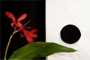
Fast foward to 2011 – I haven’t thought about it much since then as I haven’t had any photos to be printed that were flooded with red light.  Yesterday I took some photos of a monolithic scultpure for someone.  As part of the composition we placed a red orchid-type flower next to the piece and while the owner was cleaning off another plant I took some artsy type shots of the flower and scultpure.  Here is the photo that I ended up with:

Click to Embiggen

As part of post processing I increased the luminosity of the red in the flowers in order to really get a good contrast against the white marble of the sculpture.  I was pretty proud of the digital result and decided that this particular photo needed to end up in my print collection (also for sale if anyone is interested).  So I fired up Photoshop, made the adjustments to Brightness (my printer tends to print a little darker than it appears on screen) and went to the print dialog.  Unfortunately, a large area of reds in the flower were out of gamut for the printer and paper profiles.  “Dammit!” I thought, “Not this again!” I printed a low quality test and the reds were blown out, as in the subtle tonal changes were gone.

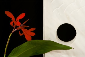
So, I consulted Photoshop help and figured out how to view gamut warnings in real time when working with the images.  As an added bonus it could reproduce the gamuts of the various paper ICC profiles I have installed.  Since I primarily use luster paper (it’s a nice middle ground between glossy, which I don’t like, and matte, which often looks washed out) I was able to get a good idea of its limitations.  I attempted to replace the colors.  While I was able to save the subtle tonal changes, the resulting colors were not really true to what I wanted:

Click to Embiggen

As you can see, the reds are now a pinkish color.  It doesn’t look bad, but it’s not the true color of the flower.  For this particular photo I wanted to stay as true to the actual colors as possible.  What to do?  What to do?

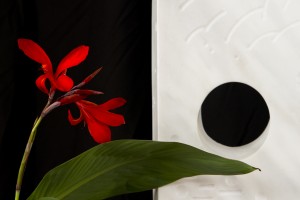
I looked at the other paper types I have and tried those profiles.  I found that with the matte finish papers I have (Velvet and Somerset) I got more of the colors in gamut, but still had a large area outside the gamut.   Then I realized that last week a couple of sheets of Ilford Galerie Smooth Pearl inkjet paper came into my possession.  I installed that profile and viewed the gamut warning.  I was amazed to find that this paper had a larger gamut than the Legion papers that I had been using.  There was still an area of reds that were out of gamut, but the area was much smaller than before.  I opened the color replacement dialog and then found the in-gamut replacement color very closely matched my original processing:

Click to Embiggen

I lost a little bit of the tonal changes, but in the final print the changes were still extremely subtle.  I score this as a win.  The print itself turned out great, although it is a little more glossy than I normally use, I can see this paper finding its way into my printer when the need arises.

What did I learn from this?  There are A LOT of different papers out there (which I already knew) but the differences in color gamut between the brands seems to be more than I initially thought.  Unfortunately, the quality papers are not cheap – my Legion MOAB Lasal Luster (11 x 17) costs US$70 for 50 sheets and that’s in the mid-range price for that size paper.  There is also the issue of ink costs (US$15 per cartridge for the Epson R2880 – these don’t hold much ink at all), time, and waste.  Clearly, experimentation is going to cost a lot of money and that’s something I will only be able to do over a long time.  If I could afford a digital chromogenic setup then I would be all set, but that’s quite the capital investment there.  The upside of this is I gained a bit of understanding of the printing process, a bit more understanding of color, and learned a few more tricks in Photoshop.  I also found that printmaking is not something simple…  there is a lot more to learn about this.  What am I getting myself into?

Well, that’s all for now.  I hope everyone is having a good Easter and I will see you all again soon.

End of Semester Crunch

I am happy to report that I am finished with my English course.  After the midterm we had 4 classes then moved straight into our final paper.  The professor set it up to where we had to give a presentation on our papers, but only a couple people would be presenting per night and you didn’t have to come to class until you were scheduled to present.  I gave mine just this past Wednesday and he gave me my final grade today (I got an A!).  The best part, once the presentation is complete, that’s it for your semester.  This definitely takes a load off my mind as we move into the final stretch.  I have one more art project, an audio tour (and accompanying paper), and two finals left to go in the next couple of weeks.

I finally finished my retail package.  I completed the design and print run about seven hours before it was due.  It took three attempts to get the printer settings correct (kinda hard with generic paper and no profiles) and it ended up being a matte finish, but that’s ok.  I cut the design and folded it and then realized that I screwed up on the placement of two words on the bottom.  As it was nearly 3 am when I realized this, I ran another print in the hopes I would get a chance to cut and fold during the class, but no such luck befell me.  It’s ok, I hope she doesn’t ding me too hard for that little design flaw.  I chose to make a wine box and made a fictitious little company called “In Vino Veritas.” The artistic theme for the design was to be something to do with self-improvement.  I chose “Believing in Yourself” and put little inspirational quotes over photos of things that we as human beings have accomplished.  The first was the discovery of DNA, the second was Mount Everest, the third was Neil Armstrong with the US Flag on the surface of the moon, and the fourth was a picture of the Earth as seen from the moon.  On the bottom I put “In Wine Lies Truth” (it was here I messed up the placement of the words “In” and “Lies” – they were partially covered by the fold flaps).  On the top flaps I placed a solid color and little scattered graphics of wine bottles.  Here is the template graphic for the project:

Click to Embiggen

Some of you out there may recognize the 366th Fighter Wing motto, but I digress.  The professor has the completed project at this time.  When I get it back I will take some photos to show what it looks like in its final form.  I wish I would have had time to take it to Kinko’s to have it printed on glossy cardstock as the matte finish doesn’t allow the colors to pop at all.  But hey, at least I got it done.

Now my wife is wanting me to design some boxes for the giveaways for her parents’ Golden Anniversary next year.  Is it unethical to charge this to my in-laws?

Now I’m on to my next project, which is to create a postage stamp.  It can be from any country, real or imaginary, and has to have at least one example of each of the following: a currency notation and price, a scanned texture, and an edge like you see on real postage stamps but this one has to be created using Photoshop’s vector pen tool.  I have a few ideas and will hopefully begin executing them shortly.

Sweetness came to me today in the form of a piece of plastic.  I have been wondering about pinhole photography for a while, but never really felt like buying a body cap and drilling a tiny hole into it to give it a shot.  The other thing that turned me off about that idea, too, was the fact that the hole would allow dust into my sensor while the mirror was up.  Well, I have to worry no more…  I found out Lensbaby makes a pinhole optic for their Composer lens.  And it is only $35 at Camera Co-Op.  Happy Birthday to me!!!  Tomorrow I will be taking it outside while the sun is high so I can see what my mind can create.  I am soooo looking forward to this.

At this point I have one more picture I can share with you from my gallery.  Feel free to comment at will.

Click to Embiggen and See Gallery

Well, my friends, I need to pop in that Celtic Frost CD and get back to work.  You all have a safe and happy Easter Weekend and I will see you all again soon.

An Evening at the Museum

I know it’s a corny play on a popular movie title.  I just couldn’t leave it alone.

Thursday nights at the Museum of Fine Arts Houston (MFAH) are free to the public courtesy of the Shell Oil Corporation (you know – that big evil oil company).  Another good thing about Thursdays is that the museum is open until 9 pm (again, thanks to Shell, evil corporation that it is).  My Digital Art professor told me about the Heinrich Kuhn exhibit currently at the museum.  Well, thinking that the price of admission (free) was perfect, I thought it would be a nice way for my and my wife to break the monotony of mid-week life.  So, off to the MFAH we went.

The first exhibit we visited was the Carlos Cruz-Diez exhibit.  For those of you not familiar, Cruz-Diez has spent his life studying color perception and translating that to his art.  The exhibit progresses from his early experiments with color in the late 1950’s all the way to his sophisticated physichromies of today.  Much of his work is centered around the changing perceptions of color and shape as we move from one point to another.  During the progression you can see the increasing sophistication of his work.  Along the way we see shapes added.  Shimmers are soon added.  Then we see shimmering shapes.  Then there are light plays as the vertical lines in the piece are not of equal widths throughout.  Then there are plays on the orientation of lines.   They all add up to amazing effects on a piece as you move from one side to another as you view the work.  The MFAH has one of his chromosaturation pieces where individual rooms are bathed in colored light.  Each room is a different color, and it’s amazing how the color changes are quite abrupt.  It’s hard to imagine how he came to this work, but he definitely challenges the viewer’s individual perceptions on color.  I personally have never seen anything quite like it before.

The second exhibit I visited was the Heinrich Kuhn exhibit, entitled, “The Perfect Photograph.” The works on display are (mostly) Kuhn’s work from just before the turn of the century to just after the start of World War I.  One thing I found interested was the fact that there were no silver gelatin prints present.  All of the prints were made using an “alternative” process.  Mostly there were gum bichromates, platinum prints, oil transfers, and combinations thereof.  There were a few other processes present, but these aforementioned made up the bulk of the pieces.  The thing that really caught my eye were the gum bichromate prints.  Some of these prints were, what I would guess, around 2′ x 2.5′.  Keep in mind that the gum bichromate process is a contact process.  What this means is that the negatives have to be the same size as the final print.  How on earth, in the absence of an electric enlarger, make negatives this size?!  Unless his camera took negatives this size (which is doubtful given just given the size of the lens necessary to cast that large an image circle), I just can’t figure out how he did it.  I did by the book they had on sale in the museum retail shop, but I have yet to crack it open.  Hopefully it will reveal his secret.  I’ll keep you posted on that.

As for the pictures themselves, they were pretty amazing.  The skill shown, especially where gum bichromate is concerned, is definitely that of a master.  Some of the pictures on display would definitely look quite ordinary and uninteresting with the cold precision of a modern digital SLR, but the alternative processes give them a life that, at times, seems otherworldly.  The roughness of the watercolor paper (modern photographic paper is basically watercolor paper coated with light sensitive silver salts) is counteracted by the soft edges on the subjects themselves.  There are landscapes, portraits, nudes, and scenes in the collection.  Around the turn of the 20th Century photography was considered by many as a mechanical endeavor.  This was also an image that some photographic societies wished to maintain – John Pouncy, the “father” of the gum bichromate process, was sharply criticized by the London Royal Photographic Society for his work because they felt it crossed too much into the world of art for it to be considered a photograph.  Kuhn’s work (along with others of his time such as Eduoard Steichen) seems to mark a turning point to where photography started to receive consideration as an artitistic medium.

The final exhibit I visited was the Neoclassical collection.  The MFAH currently has on loan some masterpieces of the Neoclassical era from museums all over the world, including the Louvre in Paris.  I won’t bore you with the ones that I really liked because many of these are very familiar to us, whether we know them or not.  One thing to keep in mind, however, is that nothing compares to seeing a work of art when the actual piece is in front of your eyes.  Pictures in a book or a on a computer screen are not the same.  Such masterpieces as Oath of the Horatii by Jacque-Louis David and Ernst Matthai’s Venustake on a whole new life.  I said I wasn’t going to bore you with my favorite, but this is an obscure piece and it really seemed to strike me.  It is by John Flaxman and it is called St. Ethelburga With Her Chaplain, St. Paulinas of Rochester, Bringing Christianity to Northumbria. The piece is done in pen and ink with gray wash.  The drawing is of four figures walking from right to left through a forest.  The forest itself is gray but the figures walking are pure white outline (the whole piece is outline, but the gray wash adds texture and feeling to the forest).  The figures seem to be glowing, as if having come just short of divinity while still in the mortal realm.  The piece itself is very haunting (and I would guess it was part of the inspiration for the cover of the Beatles album Abbey Road.  Alas, I have yet to find an electronic reproduction anywhere to show you, but I am still searching.  Plus, I want a print for myself.

Thus ended an evening at the museum.  There are some new exhibits starting soon and I am going to make sure to get down to those.  Well, it is officially Sunday morning now and I do need to get some sleep.  Have a good night, everyone, and be sure to visit the links below to see some of the things I was talking about.  Take care.

Carlos Cruz-Diez Website
Museum of Fine Arts Houston (from here you can get to the three exhibits mentioned above to see some of the key pieces)

On to Project 4 and Other Assorted Updates

So I have 3 Digital Art projects down.  The next one is moving a little bit outside the creative realm and more into the graphic design realm.  We need to create a retail package of some sort with the theme being something about self-improvement.  For this project we will need to use a container template, design the packaging to fit in the constraints of the template, print the template and design on cardstock, and then cut and build the package.  I’m not really looking forward to this as I know that graphic designers do some amazing and creative things, I’m not very good at it and I don’t particularly enjoy doing it.  I’m going to spend the next few days just coming up with a theme and then selecting my template to work with the theme.  Let’s hope I can come up with something good so I can maintain my grade in the class.

My last project was generally well received by my classmates when we did the discussion during the last class.  I was not particularly satisfied with it, but perhaps my eye is being more critical than theirs.  It isn’t a bad thing if I’m being more critical of it.  As far as I can see, that critical eye will help me create the best piece I can.  I’m anxious to receive the instructor’s critique about it.

Work continues on my other 2 research projects.  To be honest I didn’t get very far at all this weekend as far as those went as I pretty much just played Dragon Age: Origins when I was at home.  The good news is that I completed the game.  Now on to other matters.

I found out that I’ve completed the requirements for my AAS Management degree using the 2007-08 Academic Catalog.  I completed these requirements but for some stupid reason never applied for graduation.  That will be something I do this week in order to receive that degree at the end of the summer term here at the college.  As far as my other goal, that’s in a little bit of a nebulous state right now.  When I did some cross-comparisons of course numbers, I’m finding that the University of Houston does not have any corresponding numbers to some of the classes I’ve taken thus far (which really applies to my natural science and math credits).  There are also a couple of questions I have concerning courses already taken.  I plan to take a mini-term class in May in order to fulfill my Governmnet II requirement, but beyond that I’m going to need some guidance from the University on which direction I should go in the Fall semester.  My biggest problem is finding time to get down to the University of Houston (I live on the NW side of the Houston, the UH main campus is about 10 miles south of downtown) and then finding the right person to speak with.  I do know I need to get this figured out soon.

Right now I’m on a campus library computer as my English class did not meet tonight.  For the entire month of April we are doing presentations (for our research project) and nobody signed up for tonight (which is no wonder, it would have only given people ONE week to do a major research project).  So now I guess I will get off here and head home to spend some time with my wife and my dogs.  You all have a good evening and I’ll be back soon with another update.

PS – I can feel my muse starting to whisper in my ear again…  let’s see what she inspires me to do next.