Again we start rolling around to another month and I haven’t posted any updates. So, here goes with the latest adventure in Rick’s Picture Corner.
As you all have probably noticed lately, a lot of these posts have been focusing on works created in Photoshop. This is primarily due to my work in one of my classes (Computer Imaging) in which I am working almost exclusively in Photoshop CS5 to create the works for class. Don’t forget, these are pictures, too. I’m still shooting, but a lot of my time with my camera has been taken up by my Fundamentals of Digital Photography class, and most of the work done there thus far has been technical in nature (such as shooting equivalent exposures, etc.). In the most previous assignment and in the upcoming assignment I had license to be creative, and I will share the results with you on those very soon. But as such – on to the artwork at hand.
The self-portrait project received a grade of 90… just barely ‘A’ category. I was told that the kidney stone narrative was my weakest due to the use of filters. I’m actually interested to know how the break down of the because the only thing we received was a strip (I’m not joking) of paper with a grade and a quick comment. At this point I am not sure how much I was dinged by the use of the filter, even though I offered a valid defense as to why I used it. I suppose I could just ask her, but I’ll probably just let it go.
The project we just completed for the class was to incorporate text in 2 ways – in the first piece we were to make a poster, flyer, etc for an event, with the only caveat being that it had to be entirely fictional. Oh, and we were supposed to emphasize art over commerce (whatever that means). The second piece was to be a purely fine art piece incorporating text in some way. It was on this second piece where things got a little tricky.
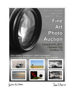
For my first piece I came up with the following:
This, as you can tell, was for a fictional Fine Art Photography auction. This was a pretty straightforward composition. I used the lens photograph as the dominant element to draw the viewer in to the composition. The reflection in the glass pushes the eye out to the main text. Once the person finishes reading the main text, he or she is transported to the bottom, where the eye seems to naturally flow with the text and photographs. The white border simulates a window mat (standard mounting for photographs) with signatures from John and Jane Q. Artist at the bottom of the window. I placed white borders around the individual photos at the bottom to simulate window mats there as well.
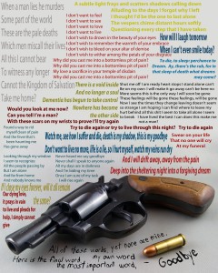
Now, the second composition was a little more difficult, but this is what I turned in:
This particular piece drew some quick visceral reactions from some of my classmates (I could see the looks on their faces). I won’t get into the why, but I can (and did) defend every artistic decision I made with this piece. I had a few questions on the choices I made with the text, especially regarding the text above the gun. I defended each choice and the person asking seemed satisfied with the answer given, except toward the end. One particular person seemed to get a little nit-picky about different elements and I shot each statement and question back with a defense. Her neighbor chimed in with a subtle just let it go statement and the professor finally made the final statement regarding this piece. Feel free to comment as you like – the only thing I ask is that if a discussion develops, keep it respectful.
Well, that’s it for tonight, folks. The point of this entry was to share my recent work with you all. The days are getting busier as we start heading into Week 10 at UH and Week 9 at Lonestar, which means I’m over halfway to the end of the semester. I do have more to talk about, but that will have to wait another 24 hours. To all my faithful and not so faithful readers – I bid you goodnight.

