The Museum of Fine Arts – Houston is currently hosting a rather large exhibit on photography in war. The pieces themselves date from the modern all the way back to just a few years after the origins of photography. The exhibit itself is very large. In fact, it takes up the entire mezzanine in the Caroline Weiss Law Building of the museum. Contained in the exhibit are mostly prints, but also a few artifacts, such as pieces of camera technology used in combat zones during different periods, some preserved publications, and even some private journals from journalists and military members.
Most of the prints are original, such as the beautiful Daguerreotypes and silver gelatin prints, but there are also some inkjet prints of older photographs. I loved seeing the original prints from the older processes. There were several albumen prints, at least 2 salt prints, 1 carbon print, and, believe it or not, an autochrome print from France during World War I. There is also one photo from the World War II era that is digitally manipulated, but we will get to that one later.
The reactions I’ve gotten from a couple of my peers who have gone to see this exhibit before me were both pretty much the same – the exhibit was wonderful and that their minds were “officially” blown. I had to disregard those reviews so my hopes wouldn’t get too high regarding what I was about to see. I also needed to suppress my own experiences in order to keep that from clouding my judgment regarding the exhibit, which was, of course, going to be the more difficult task. So, with my mind as clean as I could get it, I walked into the exhibit and began to take it in.
The first thing that struck me was the sheer size of the exhibit. I mentioned earlier that it occupied the entire mezzanine in the Law Building. For those of you familiar with the Law Building at the MFAH, then you can appreciate the sheer amount of space dedicated to this photography exhibit. The nearly 3 hours spent walking the exhibit and taking in each piece underscored the importance of war to our history as a species, as well as showing the impact it has on our lives, even if we are far removed from the fighting.
The photos themselves were arranged in a way I would not have initially thought of doing. The exhibit was broken down into different aspects of war, to include recruiting, actual combat, destruction, rest and relaxation, combat fatigue, memorials, et al, rather than by conflict or chronology. This grouping does make sense. The curator of the exhibit needed to strike a balance between highlighting war journalism while also making sure the importance of the messages conveyed by the photographers was not compromised. To have arranged the photographs in a chronological order or to have grouped them by conflict would have merely turned the exhibit into a history lesson.
As for the images themselves, I actually have seen a lot of them before. I recognized many from the “Aftermath: Exhaustion and Shell Shock” area as well as the “Aftermath: Death” areas of the exhibit. Each area contains one image that became iconic for that particular conflict. In the former it was this image of a young officer with a “thousand yard stare” after coming back from an engagement. There is also another rather famous image from the Battle of Gettysburg that shows the battlefield dead. I am a little embarrassed that I cannot provide the photo in question as there are many similar photos of the battlefield dead at Gettysburg and I can’t remember exactly which it is. Interestingly, photography started to come of age in the United States during the US Civil War. The images of the battlefield dead in the US Civil War are often cited as the impetus for the change in public attitude towards war as the camera provided the means by which the actual horrors of war could be conveyed without an artist’s romanticizing a conflict years after it took place.
There is one image in the “Medicine: Wartime Medicine and Medicine Subsequent to War” section that still haunts me. In this area the viewer is treated to photographs of people who are being tended to after suffering wounds in combat, as well as some of the long term treatments that these wounded soldiers need after returning home from battle. Many of these are photos of soldiers with their prosthetic devices (usually legs). There is one large image, the last image in the room, of a mother helping her son out of bed. At first glance one would think this could be an embrace (a function of the vantage point of the shot), but when the detail is examined, it is evident that there is a piece of this man’s head missing. Of course, we can surmise that this former soldier is no longer functional as an individual, and will now be, until the day he passes from this earth, dependent for his very survival on others. I had to ask myself which was the greater cruelty of the war – that he suffered this grave injury or that he was made to survive?
I mentioned earlier that there exists, in the exhibit, one digitally manipulated photo in the “Portraits” area. This was a full body portrait of General Douglas MacArthur standing next to Emperor Hirohito. The artist who submitted the work, however, decided to digitally insert his head on MacArthur’s body. I cannot say that I get why the artist did that, but the greater question was why the curator allowed that particular photograph into the exhibit rather than a reprint of the original image of MacArthur and Hirohito. This one photograph is definitely the weak link in an otherwise excellent exhibit.
I suppose I can’t really say that my mind was blown by this exhibit. In my Air Force days we were shown some pretty shocking gruesome images of the effects of chemical weapons during our chemical warfare training. This was to underscore the importance of the training to our survival on the battlefield. When I was becoming my unit’s SABC trainer, I also had the pleasure of watching video of battlefield triage, battlefield stabilization, and surgery at a MASH unit (all in Vietnam). The amputation was definitely one of the most gruesome things I had ever seen up to and since that point. The execution images are rather haunting, because for many of these they are the point of time just before or after one has crossed into death. In those that don’t feature the condemned about to die, it shows what their physical beings are reduced to in death, be it scrunched in hastily constructed coffins or the bloodstained shirt worn by the condemned as his sentence was carried out. The one that will continue to haunt me, however, is the image I described earlier of the man missing part of his head. The image begs the question I asked at the end of the description, and it’s not one easily answered.
The 1971 film “Johnny Got His Gun” may be streaming somewhere on YouTube or Vimeo. If not, you can order the DVD through Netflix. After you watch that movie, you will understand why I ask that question.
As for now, I leave you with me during my participation in one of the many wartime operation exercises that were conducted in Korea during my time there in 1994 and 1995.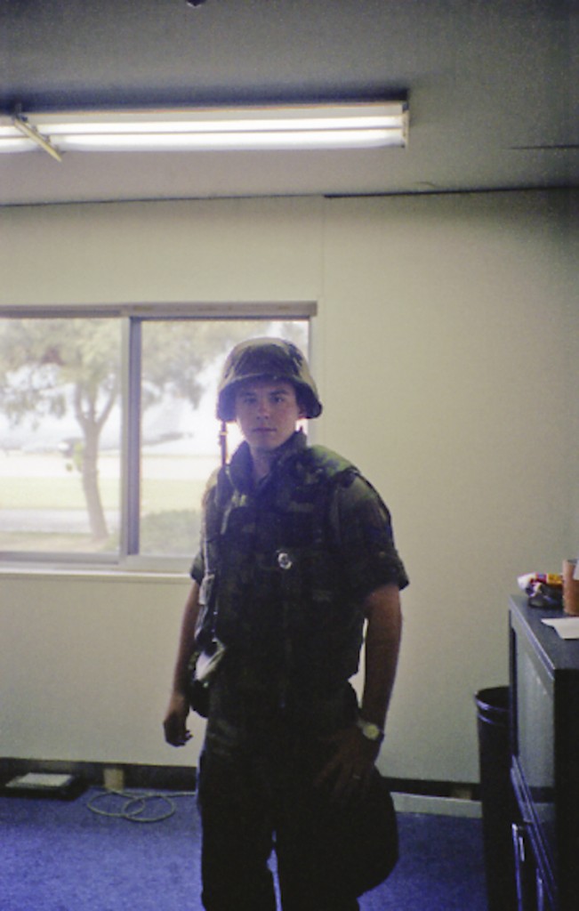
Leave a Reply