Category: Critique (Page 2 of 2)

Rabbit Portrait

It’s been a while since I’ve posted anything here. I got a little busy with other things, but now things seem to have settled down a little bit. I can play catchup in other posts, but right now I want to discuss an image I saw in Color Magazine today.

The picture below is part of a series called “Transcendence” by Kimberly Witham. The picture is entitled “Rabbit Portrait”:

This is not the first image that caught my eye in this series, but it was the first image that made me realize something unusual about all of the animals in the series. What challenged me most was the look in the eye of this rabbit. It looks shocked and alert, sensing danger and trying to find the direction from which it is coming. But then I questioned how this was on a pure black background. That’s when I realized that this rabbit is dead. All of the animals in the series are dead. I was shocked and more intrigued at same time. Death is a pretty morbid subject for any medium, but the images here actually were quite powerful. Just to make sure I went back and read the artist’s words on the series and confirmed that they were indeed dead animals.

The image seems to beg the viewer to question how this life met its end. The shocked and alert look on the rabbit’s face makes me wonder if it was frightened when the end came. It certainly doesn’t look as if the animal accepted its fate. Perhaps the rabbit did indeed accept the inevitable, but was frightened of what it saw ahead once it crossed over into death. The rabbit’s repose suggest that the end was anything but peaceful.

All in all this is a pretty powerful picture, as are all the pictures in the series. I encourage you all to look at the entire series for yourself at http://www.kimberlywitham.com/. I invite your comments on what you think of this image and/or the series.

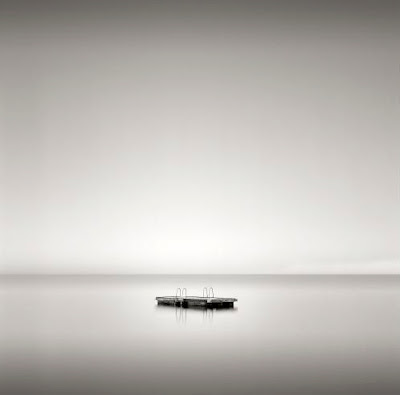
Diving Tower Study 1 by Marius Rustad

As I’ve said before, minimalist photos rank are my favorite. To take simple elements and bring them all together to create a powerful image takes a vision and a mind beyond my feeble skills. This picture by Marius Rustad is no exception as it is a powerful photo.

According the short bio of Marius contained in “Silvershotz”, he was an only child, but he says he never felt alone as he was growing up. I can certainly see how this translates to his work. The photo here shows the lone diving platform, but one does not get the impression at all that the sense of loneliness one would normally get from an image such as this. Instead, the platform seems to enjoy its place in the seeming void of the water. This sense is reinforced by the perfect calm of the water, making the reflection nearly flawless. If it weren’t for the reflection and the darkening color of the water at the horizon, it wouldn’t be much of a stretch to believe that this platform is floating in the air. The calmness of the water also provides serenity.

The placement of the platform suggests that while it is far away, it is not so far that it is inaccessible. On the contrary, the platform seems to have chosen this spot as a small test of one’s worthiness to climb aboard. The test is there, but not impossible, or even hard, but still must be passed.

One area where this photo really stands out is the tonal range. The smooth tonality here is impeccable and was the first thing I noticed about this photo. The serenity offered by the calmness of the water is strongly reinforced by the ultra-smooth tonality of the photo. The only break throughout the photo (aside from the platform itself) is the horizon, but even that serves as a compliment to the overall feeling of the image.

The clarity is amazing, owing in part to his use of a 6×6 medium format camera (which is why the image is square). Medium format cameras use film that is larger than the standard 35mm film to which most of us are familiar. The result is superior clarity in smaller prints, with the ability to make larger prints.

I would encourage anyone to look at more of Mr. Rustad’s work, which can be found by clicking here.

What do you think of the photo? What does it say to you?

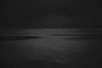
Spring Sea Ice by Roberta Holden

In my first semester photography class we studied with only black and white photographs. One of the dictums we were taught was that there images should be very dynamic tonally. The range should always begin with black and end with white. I suspect this rule was put into place to help us develop an eye for contrast (not to mention to provide a grading criteria) as in the world of art there are no hard and fast rules.

That’s what sets this image apart for me. The image is low on contrast, seemingly underexposed, and contains no pure black and no pure white. In my first semester class this would have not quite earned an ‘A’. But these things are merely technical, it’s what the image says to me that is important.

This image was taken in northern Canada and I assume it’s above the Arctic Circle. The harsh environment in that part of the world makes it a desolate and lonely place, not unlike those environments of the other extreme known as deserts that populate almost every continent. Here Ms. Holden captures that desolation. The darkness of the photo gives us the sense of the cold and lonely desolation in this part of the world. While most photos I see of the polar regions are taken in the day, the nighttime capture here adds weight to the feeling.

Not a lot of people know much about this part of the planet, mostly because barely anyone lives that far north. Ms. Holden makes no attempt to try to force more understanding here. The motion of the ice and water is captured in long exposure. The mystery of the Arctic environment is highlighted by this motion blur. We can see enough to know what is there, but not enough to form any sort of coherent understanding. Along with the sense of desolation, the darkness adds to the mystery of the region.

The absence of pure black and white, along with the low contrast, challenges our thinking of this environment. Polar regions and deserts are opposite extremes in terms of environment, and they are rightly thought of that way by most people. The lack of dynamic range and contrast for the most part forces us to consider that the environment is not what is extreme, it is our thinking that makes it extreme. Here we see that it this area is just what it is… the result of nothing more than its geographic location on the planet.

These simple elements all combine to bring a high level of complexity to this minimalist photo. Very few minimalist photos can convey so much, and of this work Ms. Holden I’m sure is proud. To see more of her work, you can visit http://www.nobarriersphotography.com/. I’m interested in hearing your thoughts on this photo as well.

Migrant Worker 2 by Peter Liepke

I was running some errands on Monday morning before heading to the tire shop to replace the tires on my vehicle. I stopped by Best Buy to drop some old cell phones in their recycling bins when I decided to head over to Barnes and Noble to pick up a photography magazine to read while waiting for the tires. As so happens I picked up a copy of Silvershotz. This is one of many fine art magazines out there and one with which I was not quite familiar.

It was in the current (Volume 6 Edition 1, International) issue that I first spotted the work of Peter Liepke. At first I wasn’t sure if these were photographs in these pages as there seemed to be no focus in the images whatsoever. I learned that the images were mostly gum bichromate prints. This process was developed in the 19th Century and gives a very painterly look to the photograph. The images I am discussing today was printed using this process.

Migrant Worker 2 by Peter Liepke

What can I say about the composition here other than it seems to be perfect? The sky, earth, and person all have an appropriate sense of scale, where the earth is bigger than the man and the sky is bigger than both put together. With the man all alone in the field, we can see the enormity of the task before him. Holding his tools he is looking down and focused on what needs to be done. Although the clouds appear overhead, through them we can see the rays of sun shining down on the man. It suggests that although his labors are hard and long, his reward awaits him in Heaven.

These elements all compete for attention, but no one element overpowers the other. The loneliess of the worker is telling. I have to admit that I myself am ignorant of the mind of a migrant worker, but here the image suggests a loneliness felt. Perhaps he feels forsaken? That could explain why his back is turned to the rays of light. Or perhaps he is so focused on his task that he fails to take notice of the beauty behind him? There are countless theories as to why this is. Here through the whole image there is more clarity than in some of Liepke’s other images, but nowhere is the image tack-sharp. This makes the image almost surreal, as to suggest that while we know about migrant workers and how hard they work, as mere observers we can never know truly their life experience, which is the reason we will never know why his back is turned on the sky.

In the Silvershotz article Mr, Liepke discussed some of his philosophy. In general he is against the current trend of showing vulgar and bleak scenes that highlight the failures of society and individuals. He sees himself as more a detached observer who wants to record the inherent beauty, and to show what could be instead of what is. Most of all, he wants to instill an inspiration with his work. With this image, while he shows a reality, there is an inspiration that can be gained.

I’m going to admit right away that this wasn’t my first choice from Liepke’s body of work to critique. My first choice was an image entitled “Poet’s Walk”. Unfortunately, that image is not found on his website and the only copy I could find on the web was less than satisfactory. But this image struck me. The balance of the tones and composition could not be ignored. All in all this is a beautiful image that could easily find itself amongst a collector’s favorites.

Anyone have any thoughts or ideas on this particular image?

Newer posts »