Tag: photography (Page 2 of 2)

Condensed Information

I’m not going to bore with you a big long academic style artist statement.  But truth be told, it’s because I don’t have one at this point to describe this work.   But here’s a little bit of a breakdown…

Sugimoto did a famous series in the 1970’s and 80’s whereby he set up his 8×10 camera in a movie theater (both indoor and drive-in) and he exposed the film for the entire length of the movie.  He would start just as the projector started and would only close the shutter after the final credits rolled off the screen.  Here his goal was to show us about too much information.  Too much information, of course, is light.

I’m seeing things a little differently.  The information from the screen comes at us in a constant stream and we must synthesize it as it comes.  We have the luxury of those streams at that time.  Here we condense the entire video into a single frame.  Perhaps this is a representation of the fact that we receive so much information that we can’t possible synthesize it all.  Or could it be a function of memory?  We can take in the information fine when it is streaming, but looking back and trying to get to it – well, that’s a whole other issue.

At this, the final song in the album that is playing has come on and it’s time for me to go.  Here are the 2 images I just created.  This series will grow, and hopefully my understanding of its significance (as well as that of the series by Sugimoto).  Rather than the venue, these are titled by the video that played for their creation.

As always, comments and critiques are welcome.

Kara Hearn - One Thing After Another

Kara Hearn – One Thing After Another

Kara Hearn - The Temporary and Heroic Transcendence of One's Fate

Kara Hearn – The Temporary and Heroic Transcendence of One’s Fate

Sources

A big part of what I like to do regarding photography is to draw elements from other sources and work them into my own art.  This commonly goes by the name appropriation.  The subject itself can be a thorny one.  There are issues of originality (think Sherrie Levine) and also, even more importantly, issues of copyright.  I tend to draw from things I know are in the public domain, such as Renaissance art and publicly available graphics (such as NASA or CDC photographs.  Even this gets a little thorny at times.  I read somewhere that Microsoft owns the rights to digital representations of the Mona Lisa.  I don’t know if that’s true or not, but if it is really does negate the concept of Public Domain.  Carrie Mae Weems ran into trouble with her “From Here I Saw What Happened and I Cried” series.  To construct that particular body of work, she borrowed prints (that were at least a century old)  from Harvard University and made prints of her own from the images.  She was subsequently threatened with copyright lawsuits if she displayed the work publicly.  I can understand Harvard being nervous about the physical prints, however, in my recollection of the law they had no copyright claim to the latent images contained within the print.  Copyright law is a gray area, indeed.

And how I’ve managed to go off on a tangent in my opening paragraph.  I actually intended to make this about stuff I find.

There is a place here in Houston called “Texas Art Asylum.” Inside this nondescript building is a veritable treasure trove of castoff items.  One can find post cards, cassette tapes, rusty nails, processed film, slides, photographic prints, old electronics, little green army men – let’s just say there is a lot of stuff contained in that establishment.  I mainly go in and purchase the prints, the processed film, and the slides.  It’s a good day indeed when $2.00 will yield you 155 frames of 35mm color film.    In my most recent visit, I acquired the aforementioned film, along with some medical school CT scan slides and a rusty spike (which will be used in an upcoming photo project).

Scanning the film and slides, however, is the hard part.  It just takes a long time.  I also had a bit of a backlog from my last visit to Texas Art Asylum.  Today I finally managed to finish the scanning of the new items and got to work on some of the backlog.  The backlog consisted of slides from E-6 film.  I don’t normally look at the slides before buying them (except for the medical slides).  I find the discovery process during scanning yields some amazing inspirations.  Imagine my surprise when I scanned the slides and found some  to contain images of Renaissance Art.  This was definitely a pleasant surprise.  I even found one of my old favorites:

Detail of the ceiling of the Florentine Baptistery

Detail of the ceiling of the Florentine Baptistery

I don’t know who painted this scene of Hell on the ceiling of the Florentine Baptistery.  The detail in the film is amazing, and having this particular piece from which to draw inspiration is going to be fun.  I even found one with an image of Titian’s “Venus of Urbino.”  I have many more to scan, and hopefully I can find some more classic art pieces.  There are only so many vacation pictures I can stand.

Anyway, I just thought to share this little tidbit with everyone.  Just for grins, here are 2 pieces I created using elements from other works.  The first is from my own photography as well as elements from items purchased at Texas Art Asylum.  The second is a creative commons digital representation of the “Rokeby Venus” and a CDC micrograph of an Ebola virus.

Mhothainn na Spirid/Mhothainn an Phian (2013)

Mhothainn na Spirid/Mhothainn an Phian (2013)

The Rokeby Virus (2011)

The Rokeby Virus (2011)

Rock and Roll Work pt II

The call for entry for the Rock and Roll show at the Minneapolis Photo Center has been answered.  I submitted a total of 6 images to this show.  In the end I chose 4 performance images, 1 of a stage set detail, and another of the equipment sitting on stage, waiting to be picked up.  This was by no means an easy decision, as I have hundreds of good quality images in my archive (from thousands taken) and I had to narrow down to around 5.  I say around 5 because the entry fee allows for 5 images, with each additional costing US$10 per image.

These images were chosen for what they represent in the heavy metal genre on the side of the performer.  King Diamond, with his theatrical stage show, brings forth as much fury and power as any other more aggressive band.  The inverted cross represents the adversarial nature of relationship of heavy metal (and all of rock music) and religion.  Depravis Nocturna of Spectral Manifest brings forth his own fury while maintaining a strict focus.  As the most important instrument, the electric guitar is easily the most universal symbol of rock and roll.  Even when it is not being played, the potential energy is barely contained within.  Jeffrey Nothing epitomizes the horrific nature of some of the subject matter of heavy metal.  There exists a certain mystique to the rock and roll artist in everything from the lifestyle to the live performance.  Aaron Meyers, with the lights seeking him out, maintains and projects that mystique from the shadows as he plays his guitar during an extended solo.

King DiamondInverted Cross - King DiamondDepravis NocturnaFlying V Guitars Jeffrey NothingAaron Meyers

I want to greatly thank Stevie, Brenda, and Justin for their help in curating this entry.  Without them, I would have had a very difficult time focusing (and even beginning).  And Stevie gets an extra thanks for bringing this call to my attention.

I am under no assumption that all of these will get in, but at least 1 would be nice.

So I guess the waiting begins.  It’s time to go live my life while the juror makes his decision.

When It’s Not Your Best Side

Normally I would wait until I got home and had time to think about the images before I would even think of posting them.  This particular case, however, is one where I felt I needed to get it out.  I’m literally in my school’s lighting studio right now, posting this with my laptop on the school’s wi-fi.

This semester is one where I’ve turned inward.  In my past work, I strove very hard to minimize myself in the photograph and to keep it about the subject.  Aside from silly selfies with my wife, I normally fiercely resist putting myself in front of the camera.  I felt the need tonight.

I looked at the shots halfway through.  An overwhelming sadness came over me.

_MG_2200-2

I think I better go home now.

Rock and Roll Work

I know this rare burst of blog-writing productivity may come as a shock to some.  Every once in a while I decide something is worth sharing.

I’m in the process of answering a call for entry to a show in Minneapolis that is all about rock and roll.  In fact, that’s the title of the show, “Rock & Roll.”  The subject can be interpretive.  It can be pretty much anything to do with the music, although I think promotion shots may not be welcome so much.  On that I would need to ask, since one of the images on the website (taken by the juror) is what appears to be a promotional shot.  This looks like it’s going to be an interesting show, nonetheless.

Currently I’m curating my images for the show, and hopefully will have a collaborator on that soon.  Right now it involves picking through about 6 years of work in order to find the best images.  I have come across some that I honestly forgot I took.  I look back on some of these and can remember how I felt when I was in those photo pits taking those shots.  I want to share some of them with you.  These may or may not reflect the final images that I submit (I can submit up to 5, with the option for more should I choose to pay more).  These aren’t in any particular order and is only a small sample of what I am going through right now.

Click on each thumbnail to view the larger version.


As always, I would love to hear your thoughts on these.


“Judging America” by Joel Pares

Stereotype is defined, in sociology, as “a simplified and standardized conception or image invested with special meaning and held in common by members of a group.” (dictionary.com), and the act of stereotyping is to cast someone in a stereotype (same source).  Since a stereotype is a simplified conception, it stands to reason that the sources of stereotypes are often themselves simplified (think of thuggish gangsta rappers or satanic black metal musicians).  As a veteran of the US Air Force, I often stereotyped Marines as macho imbeciles who couldn’t think for themselves.  The verb form of the word “judge” has many different nuanced meanings (dictionary.com), but the common thread is that judgement is, as an act that conclusive after evidence is brought forth and examined.  After meeting some Marines at the DoD Weather School at Chanute AFB, I came to judge Marines, on the whole. as honorable and brave people who chose a different path of service to our country.

This verbose examination of the two words is important in understanding the series entitled “Judging America” from Joel Pares.  Below is one of the images from the series:

from "Judging America" by Joel Pares

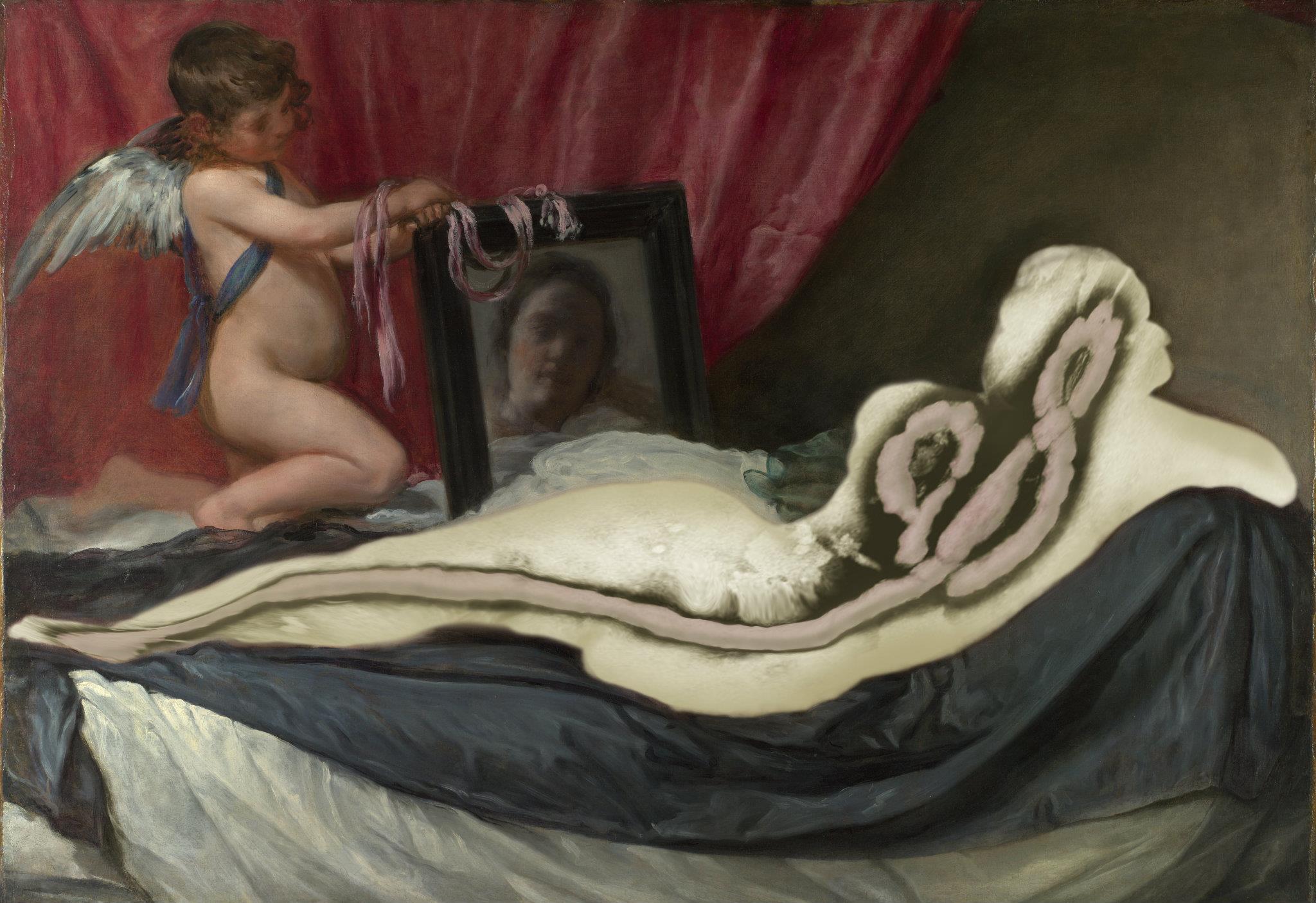
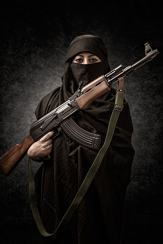
from “Judging America” by Joel Pares

As the viewer can see, the image is a diptych of sorts.  It is an animated .GIF file.  The first image is a portrait set against a black background.  In the example above, it is a white man wearing a tank top.  He’s holding a noose in one hand and the flag of the Confederacy in the other.  After about 10 seconds, the image morphs into a portrait of someone against a tan background with text at the bottom revealing the identity of the person in the portrait.  It’s the same person, but now we see him wearing a casual outfit and carrying a Bible.  His name is Jack Johnson, and he’s a full time Christian pastor and missionary.

There is no artist statement on the artist’s website, so all I have to go on regarding the concept of this project are words from a Petapixel.com article:

They say not judge a book by its cover, for photographer Joel Parés‘ series “Judging America,” that’s exactly what he wants you to do… at first. Presented as simple portrait GIFs, Parés wants you to start by judging the book — or in this case person — by his or her ethnicity, profession, or sexual orientation, and then, just as you’ve decided what it is you want to believe about the person you’re looking at, he reveals the reality.

There’s the setup of this project.  Now let’s first dive in to the formal elements.

The presentation as animated .GIF files is a novel one for diptych images, and one I have never personally come across.  Normally, a diptych is one image made up of two separate frames (think of my Armed and … series), but here we have one frame that contains two images that are presented serially.  Obviously, this raises some financial challenges as presenting the project in way that has the intended impact would require some rather expensive computer equipment.  The least expensive option would probably require a computer and a pico projector for each diptych.  The color balance is consistent throughout, even if some of the digital processing is a bit heavy handed.  In some of the images, the HDR-style processing was taken a little too far and gives some of the subjects an almost cartoonish look.  In terms of composition, there is nothing really special going on in these images.  The portraits themselves are rather conventional.  I did, however, note that not all of the images were consistent with their use of the frame.  As this is a digital project, this could be dismissed, but it could also pose problems later should Pares ever decide to present printed images.

Now that the formal elements are out of the way, it’s time to take a much more critical view of the images.  Pares is presenting these diptychs as follows – the first image is that of a portrayed stereotype, while the second is the reality of that particular person.  In each image, we are presented with someone from a different ethnic or cultural background, with one case being sexual orientation and yet another being an occupation.  Pares wants us to judge the person, then find out how wrong we were in that judgement when the truth is revealed.

It’s all about the context.  Pares removes any context external to the subject (namely, an environment) and, using the relative safety of the studio (where images are created from anything that can be imagined), adds his own context to the subject.  In all of these images, we see a blatant projection of a stereotype of a particular subject – a Latino gardener, an Asian nail salon employee, a black thug, a Middle Eastern terrorist, et al.  All of these negative images are created from, what I can only assume, is Pares’ imagination as there is no artist statement to explain the process by which he arrived at these stereotypes.  In stripping the environment and adding his own context, one wonders if these are not a projection of his own stereotypes and prejudices of those from a culture, ethnicity, sexual orientation, or occupation that is not his own.  We never get to see just the person, we only get to see what Pares wants us to see.

If one sees a man snarling and wielding 2 guns, a woman holding an AK-47, or a white man with a noose, without any other context, how does one not tend to think negatively, especially given the heavy handed nature with which it is presented, especially through his very effective use of color?  Again, there is no artist statement, so there is nothing on which to base an answer to that question.

And that brings up the difference between the words stereotype and judgement.  Pares shows us the stereotype (from whose perspective?) and wants us to make a judgement from only the evidence he presents.  Perhaps this is only the humanist in me, but I believe a majority of people are capable of realizing that there is not enough evidence presented in the images in order to make a sound judgement.

Finally, the viewer is presented with the truth of that particular person.  Pares goes from a menacing black color cast to a warm brown color cast, in order to temper the negative judgement made by the viewer in the previous image.   For this author, it had quite the opposite effect.  The feeling I am being manipulated is closer to the emotion that these images evoke when I view this project.  Res ipsa loquitur.

Why can’t an Asian woman attending a graduate program at Stanford also work in a nail salon?  Why would we assume that a man with the word “Queer” tattooed across his chest and wearing a boa couldn’t be an outreach worker?  Why would we assume that just because one wears glasses and carries a backpack that he’s a nerd?

Pares was effective with one diptych.  Jane Nguyen is an Asian lady dressed as an exotic dancer in the stereotype image while in the truth image we find out that she is a widowed mother of three children.  When it comes to seeing occupations, the person’s life outside can never be known unless it’s revealed.  The occupation of exotic dancer carries with it a myriad of different negative stereotypes.  There also exist many different reasons why one would become an exotic dancer.

If this had been a critique on how entertainment and news media portray those of different cultural and ethnic backgrounds as well as sexual orientations and occupations, then this heavy handed approach could possibly take on a greater validity.  Better yet, why can’t we see the subjects in their environments and try to see those elements of the environment that might give rise to a stereotype?  In this way, the artist’s hand is minimized, and then the selective nature of photography allows for a more natural narrative to flow, and a lot less manipulation of the viewer on the part of the artist takes place.

In the end, I’m left with the feeling that the thesis was developed, but as the project proceeded, Pares failed to adjust his thesis for the results he was getting.  Then, instead of then reexamining the results, the decision was made to push ahead anyway and try to force the art to fit into the parameters of the original thesis (this goes back to my issues with conceptual art).  Again, without an articulated artist statement, this is all supposition, but a reasonable person could come to this “judgement.” As artists, sometimes the art teaches us.  I’ve personally learned a lot about myself in my last couple of projects, and even had to adjust my thesis for one of them as what I learned contradicted my formal assumptions.  This is how we learn and grow as artists.

As to the stereotypes and judgements of US Marines, as a veteran of the USAF, it is all in the spirit of friendly inter-service rivalry.  Semper fidelis, Mr. Pares!

It’s All About the Content

I know I should really post more than once a month.  This semester is kicking my ass a little bit, but that’s not necessarily a bad thing.  I’m learning a lot and finding out things about my vision that I never realized before.  But we won’t go too much into that with this post.  Let’s go ahead and keep this one on the simple side.

I can’t remember if I mentioned this or not (and frankly, I’m too lazy to go back and look), but our in-depth topic of study this semester is portraiture.  This is a little out of my comfort zone as I’m not one to shoot people.  I guess this comes a little from a view I had of portraiture that was rather limited in scope.  I have had models sit for me before and they expected direction from me.  The problem for me in those situations was I would go into them with very little in terms of an idea other than “I just want to photograph a person in various poses.” Needless to say, it was a little difficult to get much in the way of content from them.  That’s not to say that those sessions were wastes of effort – I did get some good shots out of my subjects.  They just seemed to take a lot more effort than I anticipated.

A couple of years has passed since those early sessions.  I found out that having an idea was very important when going into a shooting session.  Currently I have 3 active photo projects.  Of those, 2 are portraiture projects that have concrete ideas attached to them.  One deals with projection and perception while the other deals with emotion.  Of course, the emotion project could be a perception/projection type project as well, but since this is a rather specific area, I am a little hesitant to lump it under that heading.  After all, isn’t portraiture all about perception and projection?  But I digress…  here are 2 images of those projects in progress (click image to embiggen:

andrew _MG_3780

I’m sure my readers can tell which is which in terms of projects.  We just had a midterm critique and I received some really positive feedback on the images in the projection/perception project.   The only real negative was one of the professors really didn’t care for the print quality, which I thought was very fair given there were some issues with the color balance throughout the series.  All in all, however, the feedback was very positive and the critiquing bodies expressed an interest in more samples as well as how I edit them down for the final series.  We ran out of time so we weren’t able to discuss the emotion project images I submitted.  I’m not unhappy about it though, as the project is specifically for my class with Keliy Anderson-Staley, and not my overall semester project (which the other is).

Speaking of Keliy Anderson-Staley, she is a professor that the University of Houston and a bit of a rising star in the fine art portraiture game.  She shoots a lot of tintype portraits.  A tintype is made when a metal substrate (tin, in this case) is coated with an emulsion and then used as the “film” in the camera.  The “film” is then developed, fixed, and washed pretty much the same as film.  The emulsion is slow (in this case it was a 15 second exposure) so Keliy used a bar to help keep my head upright through the entire exposure.   The use of tin as a substrate and the wet collodion emulsion is one of the earliest processes of photography.  She took this of me in February:
Rick_tintype

I highly recommend checking her website (link at end of article).  She has some really good stuff up there.

Well, at this point I should be heading out as it is late and I need to be awake in a little over 4 hours.  I will update again soon as a lot has happened for me, and I have many more ideas I would like to discuss.  Feel free to comment at will, and don’t forget to check out Keliy’s work.

Keliy Anderson-Staley (anderson-staley.com) 

Newer posts »